Make the value clear
Explain Rachel’s blend of writing instruction and admissions experience before asking visitors to read her full story.
 All work ↗
Client experience · Brand · Web
Turning a trusted, referral-led consulting practice into a clear, credible, and measurable digital business.
Visit live site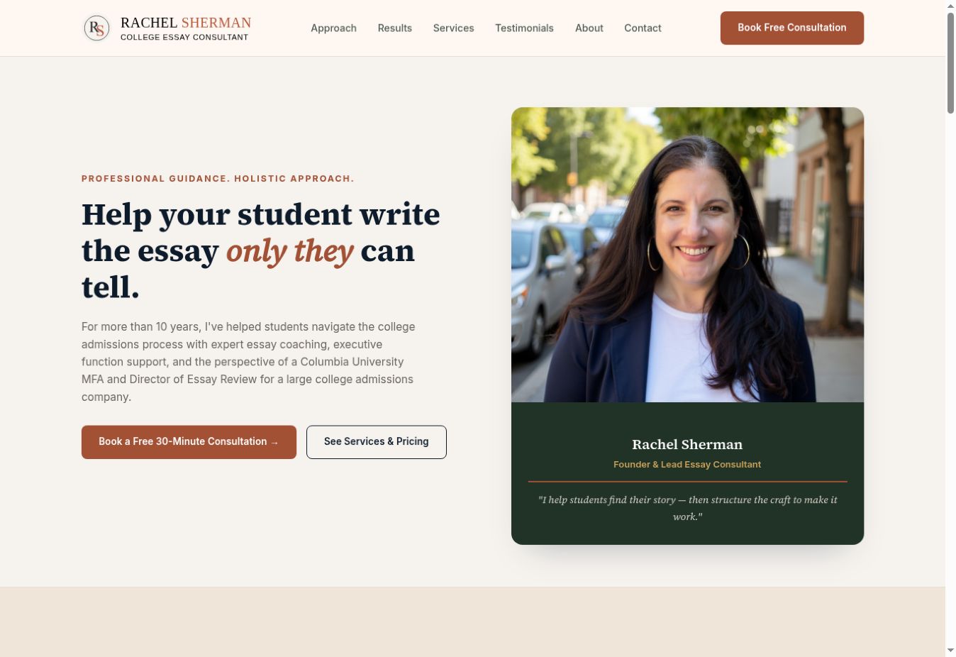
The original experience contained Rachel’s credentials, parent advocacy, and a thoughtful approach, but long passages obscured the offer. The audit found no clear consultation prompt in the hero, hard-to-scan service tiers, and a contact form at the end of a long page.
Explain Rachel’s blend of writing instruction and admissions experience before asking visitors to read her full story.
Turn five text-heavy offerings into three comparable packages and two focused services.
Bring consultation prompts and a simpler inquiry flow to the moments when families are ready to take the next step.
A long introduction carried Rachel’s story; the free consultation offer appeared far down the page.
A concise value proposition, key credentials, and a booking action appear at the top.
Five tiers appeared as dense text and checkmarks, making scope and price difficult to compare.
Three package cards and two focused services make the choices easier to scan.
Testimonials and school logos were present but visually buried or ambiguously labeled.
Shorter testimonials, separated proof points, and clearer labels put trust signals in context.
Small type, long sections, and a distant contact form raised the effort required to reach out.
Responsive layouts, readable type, visible booking prompts, and dedicated forms reduce that effort.
This compares the documented experience and delivered design. Conversion improvement has not been quantified here.
Reviewed desktop and mobile layouts, calls to action, services, proof, and readability. The synthesis identified five themes, led by a hidden conversion path and difficult-to-compare offerings.
Compared six admissions and essay coaching sites. The useful patterns were early consultation prompts, explicit proof, and pricing structures that visitors could compare quickly.
Explored two structural approaches, then mapped the proposition, credentials, approach, testimonials, service packages, and inquiry flow across screen sizes.
Tested a vibrant academic direction and a quieter editorial direction. The resulting identity connects an RS monogram, typography, color, interface components, imagery, and campaign assets.
Built the responsive site with accessible navigation and forms, connected GA4 and Tag Manager, verified seven custom interactions, and delivered reporting through Looker Studio and a weekly digest.
The work includes GA4 and Tag Manager setup, seven verified custom interactions, a weekly email digest, and a Looker Studio dashboard with top-line scorecards, a traffic trend, and tracked-event activity.
The supplied documentation shows the GA4 setup and describes the Looker Studio dashboard. Performance lift is not asserted without a comparable baseline.
“The project aligned positioning, information architecture, identity, acquisition, and analytics around one customer journey.”